


Designing for Common Ground
Inclusive design is a wonderful word, but what we actually need is designing for the minimal common denominator.

Inclusive design is a wonderful word, but what we actually need is designing for the minimal common denominator.
We can continue fighting over which screen readers can and cannot read Unicode and, through that, any fancy fonts that you have to copy-paste into a post description… Or we can start looking for the common minimal denominator of what assistive tech is actually able to do, and focus on catering towards that.
Text to Speech and Braille
For screen readers, that means no fancy fonts, not too many emojis in your text, and no unnecessary styling through HTML elements.
As a generic white girl, I love using emojis. But as a professional, I know not to overdo it. (I also know that I have to sprinkle them in here and there so people don’t think I’m mad at them.) If you have used Slack before, think about how your sentence would sound if you had to read out the emoji shorthand. And voila, there’s your benchmark! :partying_face: :tada: :confetti_ball: :tada:
The same goes for strikethrough, emphasis, and bold.
All of these can be troublemakers, but that doesn’t mean you can’t use them at all. Be aware of how they may or may not translate in practice. Emphasis and strikethrough are often ignored in text-to-speech output, but braille displays can include them: Braille characters are written in 6-point braille, which looks like the 6 dots on a dice. Braille displays that come in 8-point braille, however, can use the bottom pins to indicate special text formatting. But as I wrote before AT can be hella expensive, so don’t expect the majority to be using it. Design content for the 6-point braille and the 8-point braille power user will be fine too!
While screen reader setups vary from person to person, that’s not an excuse to say “it won’t be accessible for all anyway”. Accessibility will always be a work in progress. You can still cater towards 95% of use cases and leave the remaining 5% to screen reader developers to figure out.
Someone Call the Corporate Identity Police!
Branding needs to be perceivable to be recognizable.
Yes, rebrands cost a lot, but has that ever stopped anyone from rebranding? In most cases, nobody is actually asking for a complete rebrand. Most cases of color contrast issues can be amended by using ever so slightly lighter or darker shades, not entirely different colors.
If your brand colors are yellow on white, then yes. Yes, we are asking you to change your whole branding. There is no combination of yellow and white that passes the minimum color contrast. But in most cases, we are only asking to make your CI police cry a little bit, so we can put a 15% darker grey in the fine print.
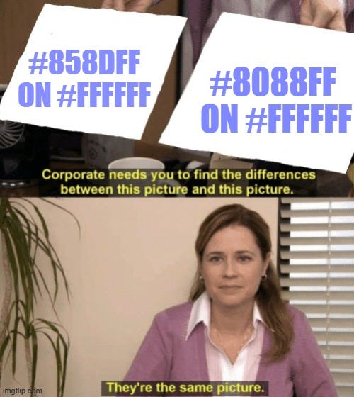
The minimum should not be our goal. There’s not much of a visual difference between a color contrast of 2.89:1 and 3.05:1, but only one of them can be ticked off as WCAG compliant.
These minimum requirements are here for a reason. They are the minimum common denominator, but neither in dating nor in design should you ever settle for the bare minimum.
Inclusive Design or Pick & Choose?
If it were up to me, I would very much love to cross out the words “inclusive design” from any designer’s professionally acceptable vocabulary because all design should be inclusive by default.
Excluding demographics should be a conscious decision, if you want to design gatekeeping into your brand, not a side-effect that you don’t care about fixing. Sure, if you want to be the next Loubutin, Hermes, or Bhutan tourism industry, go for it! But being inaccessible by design while claiming to be open to all? Oh please, stop bullshitting your customer base.